TL;DR
Are you ready to dive into the world of design systems and discover the intricate art of crafting cohesive and user-centric digital experiences? Look no further – we’ve got you covered with a comprehensive guide that will take you from A to Z in the realm of design systems.
In this guide, you’ll uncover the fundamental principles, essential components, and key benefits of design systems. Whether you’re a designer, developer, or curious enthusiast, we invite you to delve into the intricacies of creating and implementing design systems that elevate user experiences to new heights. And don’t miss the opportunity to check out the accompanying video tutorial linked below, which will provide an immersive learning experience to enhance your grasp of this exciting field.
Video Tutorial: Watch the Complete Design System Tutorial from freeCodeCamp.org
- What is a Design System?
- What are the Benefits of Using a Design System?
- How to Structure, Organize, and Implement a Design System
- The List of Components in a Design System
- The Importance of Naming Convention in a Design System
- Here Are Some Tips For Creating A Design System
- How to Learn from the Best: 10 Examples of Popular Design Systems
- The Ultimate Guide To Advanced Design System: 10 YouTube Videos You Need To See
- Exploring Design System Templates: A Jumpstart For Your Design System
- Final Thoughts
What is a Design System?
A design system is a collection of guidelines, principles, and reusable components that are used to create consistent and cohesive user interfaces and experiences across different platforms and products. It serves as a single source of truth for design and development teams, providing a set of rules and standards that govern the visual and interactive elements of a digital product.
The main purpose of a design system is to establish consistency and efficiency in the design and development process. By using predefined components, typography, color schemes, and design patterns, teams can ensure that every part of the product follows the same visual language and user experience. This consistency not only enhances the brand identity but also improves the usability and accessibility of the product for its users.
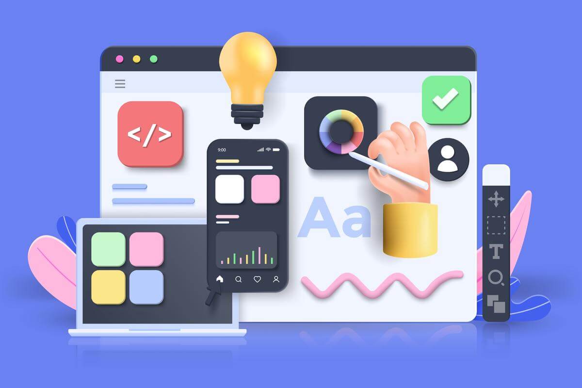
A design system typically includes:
- UI Components: A library of reusable and customizable user interface elements such as buttons, input fields, icons, and navigation bars.
- Typography Guidelines: Rules for choosing and using fonts consistently throughout the product to maintain readability and visual harmony.
- Color Palette: A defined set of colors and their usage guidelines, ensuring a consistent and aesthetically pleasing color scheme.
- Layout and Grid System: Guidelines for arranging elements on the screen to achieve a consistent and organized layout.
- Design Patterns: Predefined solutions for common design challenges, such as error handling, onboarding, and search functionality.
- Accessibility Guidelines: Standards to ensure that the design is inclusive and accessible to all users, including those with disabilities.
- Brand Guidelines: Instructions on how to represent the brand identity consistently across the product.
Design systems are beneficial for both design and development teams. Designers can work more efficiently by using pre-established components and styles, while developers can save time by reusing code and implementing consistent user interface elements.
Overall, a design system is a powerful tool that fosters collaboration, streamlines workflows, and helps create products that deliver a seamless and delightful user experience.
What are the Benefits of Using a Design System?
Design systems offer numerous valuable benefits to both designers and development teams. Some of the key advantages include:
- Scalability and Flexibility: A design system allows you to build more products without increasing your team size or complexity. You can reuse the same components and styles across different projects and platforms, and avoid duplication and inconsistency.
- Maintainability: A design system makes it easier to update and improve your products. You can change the design or code of a component once, and see the effect across all the products that use it. You can also fix bugs and errors more quickly and efficiently.
- Productivity: A design system speeds up the design and development process. You can save time and effort by using ready-made components and styles, instead of creating them from scratch. You can also use tools and documentation to help you use the design system effectively.
- Improved Collaboration: Design systems promote better collaboration between designers and developers. By providing a shared language and understanding of design elements, it becomes easier for both teams to work together seamlessly.
- Consistency and Efficiency: A design system ensures that your products have a consistent look and feel, regardless of who works on them or where they are used. You can create a coherent brand identity and user experience, and increase user trust and satisfaction.
- Elevated Design Quality: By adhering to a well-defined design system, teams can maintain a high level of design quality and create products with a polished and professional appearance. The team can follow best practices and standards for design and code, such as accessibility, performance, and usability. You can also test and validate your components and products more easily and reliably.
Overall, design systems provide a strategic approach to design and development, fostering a more cohesive and efficient workflow. They empower teams to create better products with improved user experiences, ultimately leading to higher customer satisfaction and business success.
How to Structure, Organize, and Implement a Design System
Design system architecture refers to the underlying structure and organization of a design system. It involves how the components, guidelines, and assets are structured and accessed, as well as the technology and tools used to build and maintain the system. A well-designed architecture is crucial for the successful implementation and scalability of a design system.
Here are some key aspects of design system architecture:
- Component Library: The design system should have a centralized component library where all the reusable UI elements are stored. This library serves as a single source of truth for designers and developers, ensuring consistency across products and projects. Components can be categorized by their function, such as buttons, inputs, cards, modals, etc. Components can also have variants, such as size, color, state, etc. Components should follow a clear and consistent naming convention and documentation
- Styles: Styles are the visual aspects of a design system. They include colors, typography, icons, spacing, grids, etc. Styles should be defined as variables or tokens that can be applied to components and other elements. Styles should also follow a clear and consistent naming convention and documentation.
- Design Tokens: Design tokens are a set of reusable variables that define the design system’s colors, typography, spacing, and other visual attributes. These tokens allow for easy customization and maintain consistency throughout the system.
- Version Control: Design systems are living entities that evolve over time. Version control systems, such as Git, help manage changes, track updates, and facilitate collaboration among team members.
- Documentation Platform: Proper documentation is essential for the adoption and understanding of a design system. A dedicated documentation platform should be in place to provide guidelines, usage instructions, and best practices for designers and developers.
- Design Tool Integrations: Tools are the software and platforms that help to create, manage, and distribute a design system. They include design tools (such as Figma, Sketch, or Adobe XD), code tools (such as React, Angular, or Vue), documentation tools (such as Storybook, Zeroheight, or Backlight), testing tools (such as Jest, Cypress, or Lighthouse), etc. Tools should be chosen based on the compatibility, functionality, and usability of the design system.
- Developer APIs: For smooth implementation, developers should have access to APIs that provide the necessary code and styles for each component. These APIs enable developers to use the design system components in their codebase effortlessly.
- Testing and Validation: A robust design system architecture includes testing and validation processes to ensure that components work as intended and are accessible across various platforms and devices.
- Scalability and Modularity: The architecture should be designed with scalability in mind. Components and design tokens should be modular, allowing teams to add new elements or make changes without affecting the entire system.
- Cross-Team Collaboration: The architecture should encourage collaboration between design and development teams. Seamless communication and shared resources foster a unified approach to building and maintaining the design system.
- Accessibility Considerations: An inclusive design system architecture should prioritize accessibility. It should support accessibility standards and ensure that all users, including those with disabilities, can use the products created with the system.
A well-thought-out design system architecture not only facilitates efficient design and development processes but also empowers teams to create consistent, user-friendly, and accessible digital experiences across various projects and platforms.
The List of Components in a Design System
In this section, we’ll delve into the essential building blocks that make up a well-structured design system.
Within this list, you’ll find detailed descriptions of each component, along with their respective variants, states, and recommended use cases. From buttons and typography to icons and form elements, we’ll explore how these components contribute to a seamless user experience. Whether you are an experienced designer or a novice, this resource will serve as a valuable reference to enhance your understanding of design systems and streamline your design process.
So, let’s dive into a list of common components typically found in a design system along with their details:
Button design system: how to create consistent and attractive buttons: Create different button styles, such as primary, secondary, outline, and disabled, with consistent sizing and spacing.

- Description: Buttons are interactive elements used for various actions, such as submitting a form or navigating to another page.
- Types: Primary, secondary, tertiary, call to action, etc.
- Variants: Hover, active, disabled.
- Elements: Button text, background color, border radius.
Typography design system: a guide to creating beautiful typography: Define the font families, font sizes, line heights, and font weights to maintain consistency in text styles across the interface.
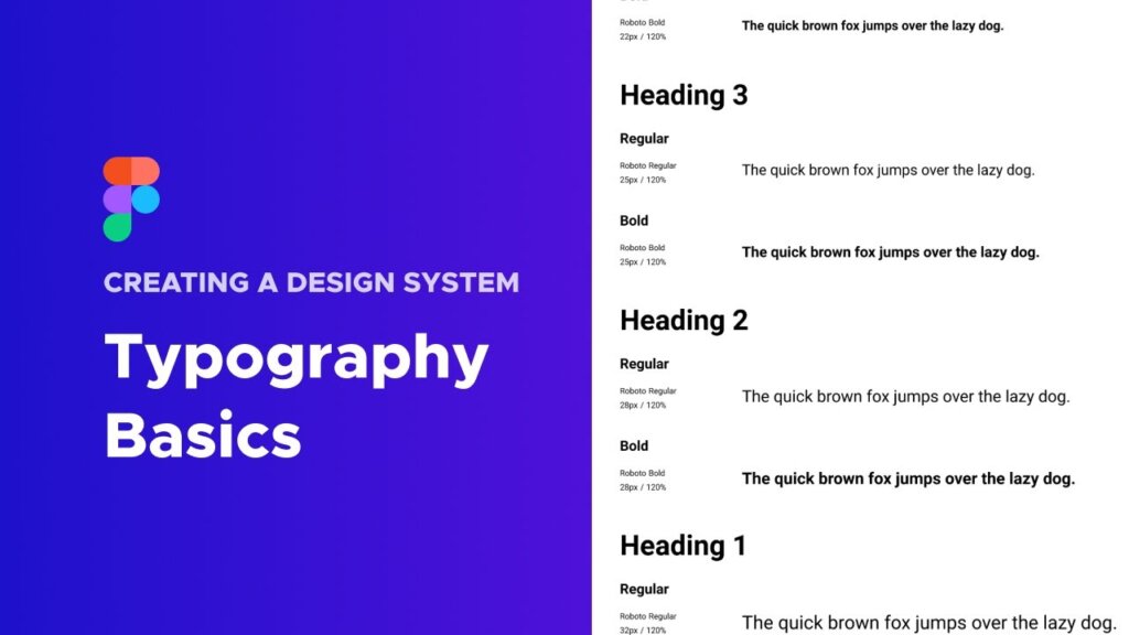
- Description: Specify fonts, sizes, weights, and styles for consistent and readable text.
- Types: Headings, body text, links, buttons, etc.
- Variants: Regular, bold, italic, underline, etc.
- Elements: Font family, font size, line height, letter spacing.
Creating a color design system – the principles and practices of color design: Establish a color palette with primary, secondary, and accent colors. Specify color codes and usage guidelines to maintain visual harmony.
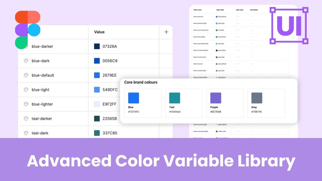
- Description: Define a set of colors that maintain brand consistency and convey emotions effectively.
- Types: Primary, secondary, accent, background, text, etc.
- Variants: Light, dark, hover, active, disabled, etc.
- Elements: HEX codes, RGB values, color swatches.
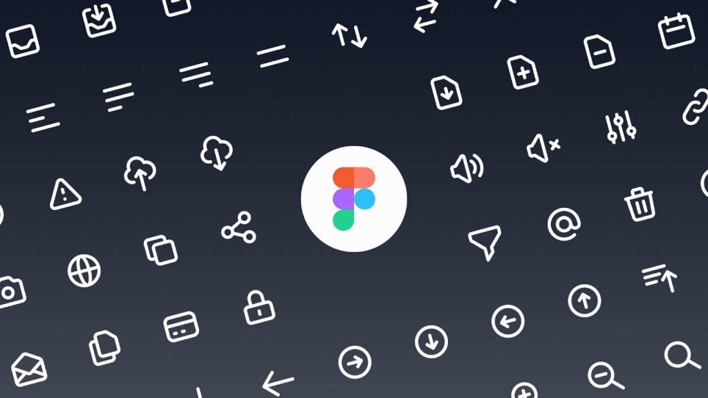
Icon library design: how to create consistent and expressive icons: Develop a library of icons to be used throughout the application. Include guidelines for icon usage and size variations.
- Description: Include a library of icons for enhancing user interfaces.
- Types: Navigation, actions, alerts, social media, etc.
- Variants: Size, color, fill, stroke.
- Elements: Icon name, reference link, usage guidelines.
Creating a forms and inputs design system – the principles and practices of forms and inputs design: Design form elements like input fields, checkboxes, radio buttons, and select menus, ensuring consistent styling and behavior.
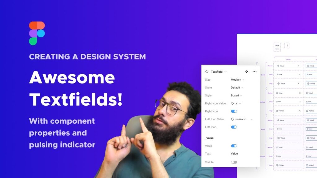
- Description: Provide consistent form elements for data collection.
- Types: Input fields, checkboxes, radio buttons, dropdowns, etc.
- Variants: Focus, hover, error, success.
- Elements: Input labels, placeholder text, validation rules.
Cards – how to create modular and versatile cards: Design reusable card components for displaying content in a structured format, such as product cards or user profiles.
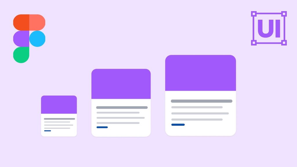
- Description: Define reusable UI components for various interface elements.
- Types: Cards, modals, tooltips, sliders, tabs, etc.
- Variants: Different sizes, styles, and functionalities.
- Elements: Component name, usage instructions, code snippets.
Navigation – design and how to integrate navigation in a design system: Define the navigation patterns, including header, footer, and sidebar designs, for a seamless user experience.
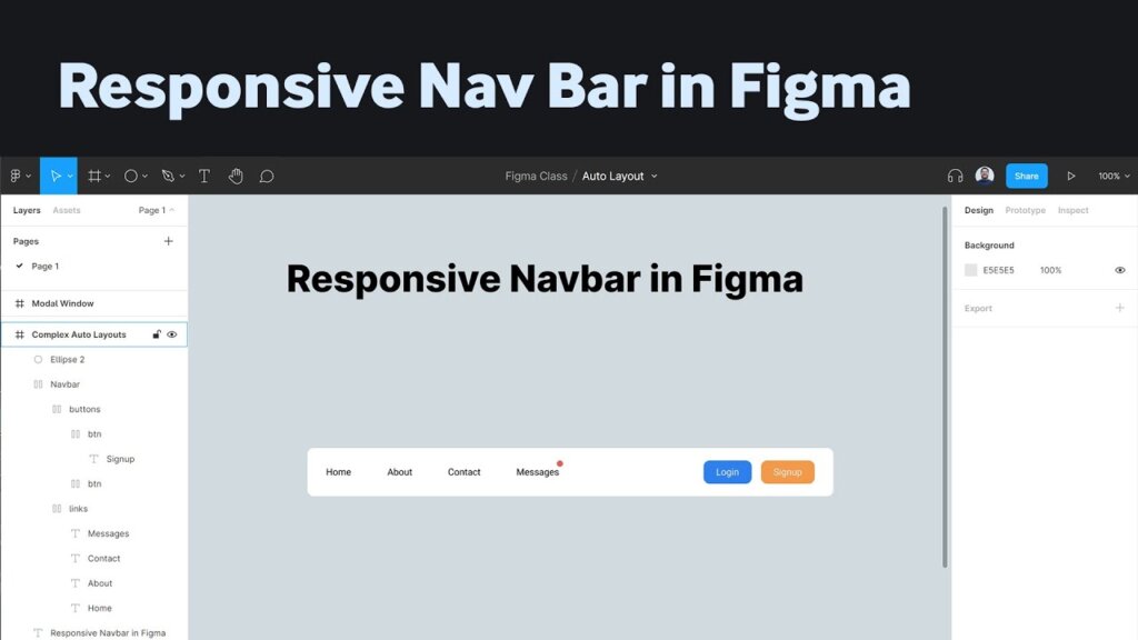
- Description: Components for navigating between pages or sections.
- Types: Navigation bar, Side menu, Breadcrumbs, Pagination.
- States: Active, Hover.
Alerts and Messages design – how to incorporate them in a design system: Create different alert styles for success, warning, error, and informational messages.
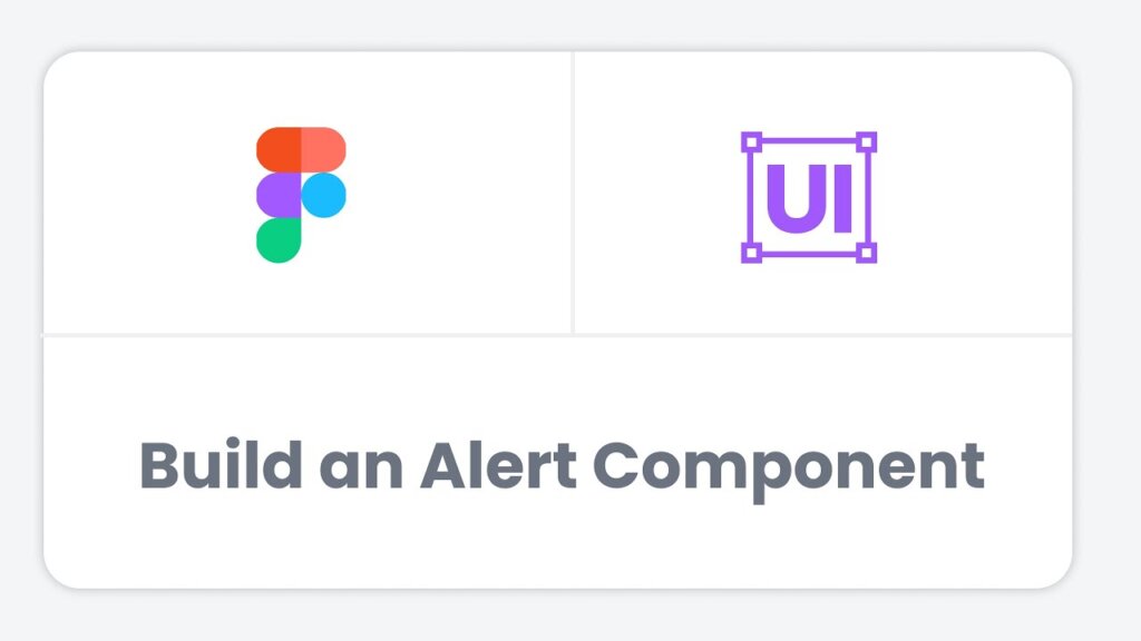
- Description: Components for displaying notifications or messages to users.
- Types: Success, Error, Warning, Info.
- Dismiss: Option to close the alert.
Avatars – How To Make Avatars In A Design System: Tips And Tricks: Include guidelines for creating consistent user avatars to personalize user profiles and interactions.
- Description: Components to represent users or profiles visually.
- Variants: Circular, Square, Rounded, etc.
- Sizes: Small, Medium, Large.
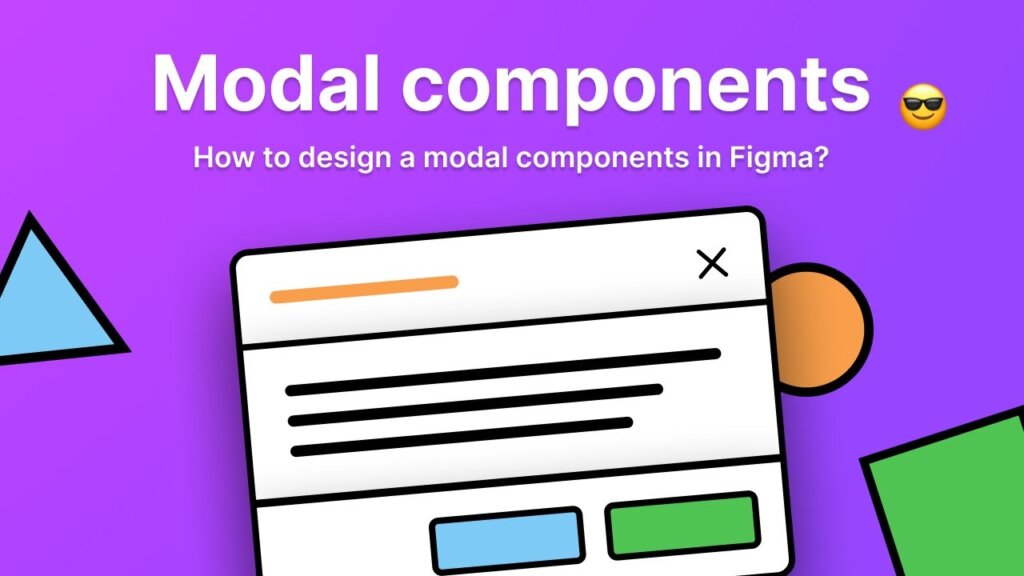
Modals and Dialogs – Learn How To Develop Modals And Dialogs For A Design System: These components facilitate consistent and user-friendly displays of critical information and data input.
- Description: Overlay components used for displaying additional content or actions.
- Variants: Full-screen, Centered, Bottom sheet, etc.
- States: Open, Closed.
Spacing and Layout – How To Master Spacing And Layout For A Design System: Providing precise guidelines for spacing and layout grids ensures visual harmony and alignment throughout the application.
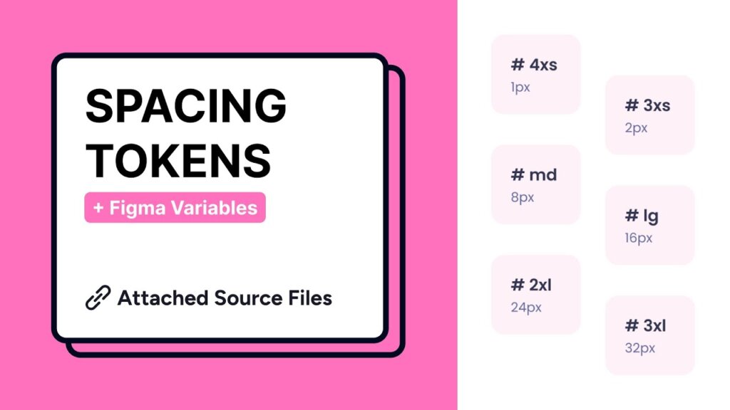
- Description: Establish guidelines for maintaining consistent spacing and layout alignment.
- Types: Margins, padding, grids, columns, gutters.
- Variants: Desktop, tablet, mobile.
- Elements: Spacing units, grid dimensions, breakpoints.
How To Achieve Smooth Animations And Transitions For A Design System: Establishing animation patterns and transitions enhances interactivity, elevating the overall user experience.
- Description: Specify motion and transition effects for enhancing user interactions.
- Types: Entrance animations, hover effects, loading spinners, etc.
- Variants: Speed, easing, duration.
- Elements: Animation type, trigger event, keyframes.
Accessibility Guidelines – How To Ensure Accessibility Guidelines For A Design System: To foster inclusivity, design systems must encompass accessibility guidelines that align with industry standards.

- Description: Ensure the design system is accessible and usable by all users.
- Types: Screen reader compatibility, keyboard navigation, alt text.
- Variants: Focus indicators, contrast ratios.
- Elements: Accessibility best practices, guidelines.
Brand Elements – How To Design And Implement Brand Elements For A Design System: In cases where the design system serves a specific brand, it may include brand-specific components like logos, brand colors, and typography guidelines.
- Description: Include brand-specific assets to maintain consistency.
- Types: Logos, brand colors, typography, imagery.
- Variants: Logo variations, color palettes.
- Elements: Brand guidelines, logo usage rules.
Please note that the specific components and their details can vary depending on the organization, project requirements, and the complexity of the design system. Each component should be documented thoroughly with guidelines on usage, accessibility, and design principles. Additionally, it is recommended to provide clear examples and best practices for each component to ensure consistent implementation across different projects.
The Importance of Naming Convention in a Design System
Creating a naming convention for your design system is a good way to ensure consistency, clarity, and scalability of your design elements. A naming convention is a set of rules or standards for naming the elements of your design system, such as colors, typography, icons, buttons, etc.
There are different ways to create a naming convention for your design system, depending on your needs and preferences. However, some general best practices are:
- Use simple and descriptive terms that reflect the category, type, size, alignment, state, or variation of the element.
- Use hyphens or forward slashes to separate words and create a hierarchical structure for the element name.
- Use lowercase letters only and avoid numbers, symbols, colors, or font types in the element name.
- Follow an “order of operations” type structure that starts with the most general category and ends with the most specific variation.
- Align the naming convention with the codebase as much as possible to facilitate the implementation of the design system.
For example, a possible naming convention for a button element could be:
button/primary/default
button/secondary/large
button/tertiary/small/disabled
You can also refer to some examples of naming conventions from existing design systems for inspiration. For instance, you can check out the below How to Learn from the Best: 10 Examples of Popular Design Systems section.
Overall, a thoughtfully crafted naming convention contributes to the success of a design system by promoting efficiency, collaboration, and cohesiveness in design and development. It serves as the backbone of the system, ensuring that all components are organized, accessible, and ready to be utilized in creating exceptional user experiences.
Here Are Some Tips For Creating A Design System
When creating a design system, starting with the basics is crucial to its success. Here are some essential tips to guide you through the process:
- Define Your Goals: Clearly articulate the purpose and objectives of your design system. Understand what problems you aim to solve and the benefits it will bring to your team and projects.
- Gather Requirements: Involve all stakeholders, including designers, developers, product managers, and executives, to gather their requirements and insights. Understand their needs and pain points to build a system that caters to everyone.
- Audit Existing Designs: Evaluate your current design assets and identify common patterns and components. This audit will serve as a foundation for your design system.
- Start Small and Scalable: Begin with a few core components and gradually expand the system. Design systems are meant to be scalable, so plan for future growth and additions.
- Create a Style Guide: Develop a comprehensive style guide that includes typography, colors, icons, buttons, and other UI elements. Consistency in design is key to a successful system.
- Build Modular Components: Design modular components that can be easily reused across projects. These building blocks will ensure consistency and efficiency in your design process.
- Involve Cross-Functional Teams: Collaboration is key to a successful design system. To ensure a holistic approach, involve designers, developers, product managers, and other stakeholders from the beginning.
- Document Extensively: Thoroughly document each component, guideline, and best practice. Clear documentation will help your team understand and adopt the design system effectively.
- Test and Iterate: Continuously test your design system with real users and gather feedback from your team. Use this feedback to make improvements and iterate on the system.
- Encourage Collaboration: Foster collaboration between designers and developers throughout the design system’s creation. Encourage open communication and a shared understanding of the system’s value.
- Consider Accessibility: Ensure your design system is accessible to all users, including those with disabilities. Follow accessibility standards and guidelines to create an inclusive experience.
- Promote Adoption: Promote the adoption of your design system within the organization. Conduct workshops, training sessions, and demos to showcase its benefits and encourage usage.
Starting with the basics allows you to lay a strong foundation for your design system, making it easier to expand and evolve over time. By following these tips, you can create a powerful and efficient design system that enhances collaboration, boosts productivity, and elevates the overall user experience.
How to Learn from the Best: 10 Examples of Popular Design Systems
Several popular design systems are widely used and recognized within the design and development communities. Some of the well-known design systems include:
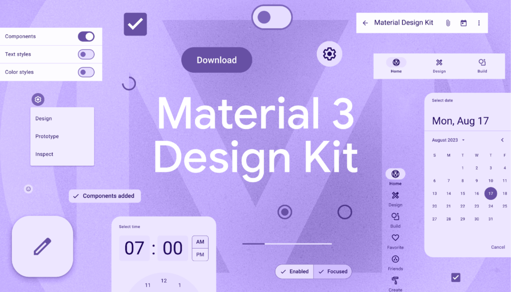
1. Google Material Design System: Developed by Google, Material Design is a comprehensive design system that provides guidelines and resources for creating visually appealing and interactive user interfaces. It emphasizes the use of material metaphors, responsive animations, and consistent UI components across platforms.
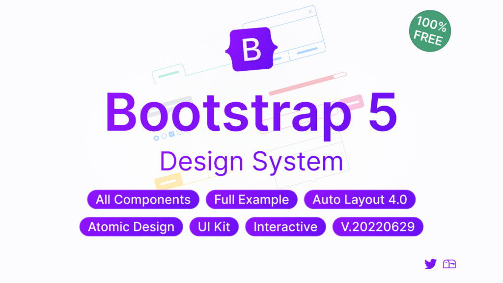
2. Bootstrap 5 Design System: Bootstrap is a widely used open-source front-end framework that includes a library of CSS, JavaScript, and HTML components. It enables developers to quickly build responsive and consistent web applications with a variety of pre-designed elements.
3. Ant Design: Ant Design, created by Ant Financial (Alibaba Group), is a design system focused on building enterprise-level products. It offers a wide range of customizable components and design patterns, making it popular among developers working on large-scale applications.
4. IBM Design Language: IBM’s Design Language provides guidelines and resources for creating consistent and accessible user experiences across IBM’s products and services. It emphasizes principles like empathy, inclusivity, and collaboration.

5. Carbon Design System: Developed by IBM, the Carbon Design System is an open-source system that offers a collection of reusable components and guidelines for building user interfaces. It is particularly popular in the enterprise software development space.
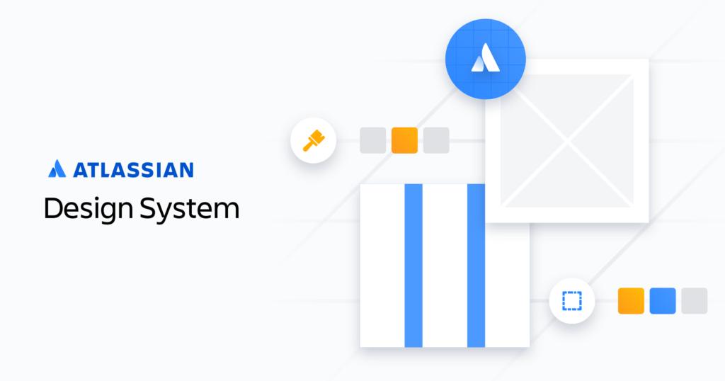
6. Atlassian Design System: Atlassian’s design system provides a set of design guidelines, components, and resources for creating seamless and user-friendly experiences in products like Jira, Confluence, and Trello.
7. Apple Human Interface Guidelines (HIG): Apple’s HIG is a design system that provides guidelines and best practices for creating iOS and macOS apps. It emphasizes simplicity, clarity, and consistency in user interface design.

8. Microsoft Fluent Design System: Fluent Design System offers a set of design guidelines and components for building Windows applications. It focuses on creating engaging, intuitive, and seamless user experiences.

9. Salesforce Lightning Design System: Salesforce’s design system provides a library of components and design patterns for creating unified and responsive user interfaces within the Salesforce ecosystem.

10. Shopify Design System Polaris: Polaris Design System provides an easy-to-follow and practical style guide for designing for the Shopify platform. It offers a vast knowledge base on utilizing UI components, visual elements, content, and design language for creating a better user experience and product in general.

These design systems have gained popularity due to their extensive resources, ease of implementation, and ability to create cohesive and user-friendly digital products. They serve as valuable tools for designers and developers, streamlining the design and development process while ensuring a consistent and delightful user experience.
The Ultimate Guide To Advanced Design System: 10 YouTube Videos You Need To See
I’m happy to help you find some YouTube video tutorials that cover creating components in a design system. Through these youtube tutorials, you can learn to create components for your design system that are reusable UI elements that can help you design faster and more consistently.
Here are the five highly recommended YouTube video tutorials for creating components in a design system, along with the section title, introduction, and YouTube URLs:
1. Title: Create a Design System with Figma – Full Course: In this tutorial, you’ll learn how to build a design system in Figma. By the end of this course, you will become a master of building design systems in Figma and understanding master components. YouTube URL: Watch Here
2. Title: Build it in Figma: Create a Design System — Foundations: Create your style guide, type scale, and brand color scheme and turn them into shared styles, grids, and typography to kick off designing a design system from scratch. YouTube URL: Watch Here
3. Title: Building a Design System for Designers: Join to hear from Lauren Duxbury and Julie Lee at Honeywell about how they evaluated, tested, and advocated for a design system that works for designers. YouTube URL: Watch Here
4. Title: Figma Advanced Tutorial: A 2-hour Masterclass: This course is tailor-made for those who have already mastered the fundamental principles of UI/UX Design using Figma. If you’ve triumphed over my Figma Essentials course or have a sneaking suspicion that there’s a treasure trove of unexplored tools, tips, workflows, and updates awaiting your discovery, then look no further! This course is your golden ticket to taking your UI/UX prowess to the next level. YouTube URL: Watch Here
5. Title: Figma for Education: Introduction to Design Systems: In this workshop, we will introduce the concept of a design system and demonstrate how to build and use components in Figma that can be shared with others to demonstrate and articulate design intent and consistency across designs. As many leading companies build and maintain design systems across their teams, the basics of design systems are helpful to know when considering product design as a career. YouTube URL: Watch Here
These video tutorials offer valuable insights and hands-on guidance for creating effective design system components, equipping you with the skills needed to enhance your design process and deliver consistent user experiences.
Exploring Design System Templates: A Jumpstart For Your Design System
Looking to kickstart your design system journey? Figma design system templates provide an excellent starting point. These templates offer pre-designed components, styles, and guidelines that can save you valuable time and effort. Whether you’re new to design systems or looking to enhance your existing one, these templates can provide a solid foundation. Let’s explore some sources where you can find Figma design system templates to streamline your design process.
Design System Template By Pixelmatters: A single source of truth for both designers and developers to create consistent digital products throughout — a collection of rules, principles, and a living library for your projects. You can use this template to create a consistent and scalable design language across your various products. This Is The Link To Download Your File.
Lookscout – Design System: Lookscout’s Figma Design System is truly the most advanced one up to date. Although design systems have been around for a while now, there was definitely room for growth. Here’s a quick glance over our UI kit & design system’s features. This Is The Link To Download Your File.
Figma Community: Figma’s official community platform often has a variety of design system templates that you can explore and use. Search for “design system” or related keywords to find relevant templates.
Figma Template Websites: There are websites that curate Figma templates across various categories, including design systems. Websites like “FigmaCrush” and “FigmaElements” might have the template you’re looking for.
Remember to verify the source and usage rights of any template you download to ensure you’re using it properly and in accordance with any licensing terms.
Please note that availability and offerings might change over time, so it’s a good idea to explore a variety of sources to find the best template for your needs.
Final Thoughts
A design system is a powerful tool that brings order, consistency, and efficiency to the design and development process. It is a comprehensive collection of guidelines, components, and assets that ensures a unified and seamless user experience across all products and platforms. By adopting a design system, organizations can reap numerous benefits, such as increased productivity, faster development cycles, improved collaboration, and enhanced brand identity.
Creating a design system requires careful planning, collaboration, and ongoing maintenance. Starting with the basics, such as defining design principles and establishing a component library, sets the foundation for a successful design system. Consistent naming conventions, design tokens, and version control further enhance the system’s maintainability and scalability.
In the ever-evolving landscape of design and technology, a design system provides a stable and flexible framework that helps organizations stay ahead of the curve. It encourages collaboration and empowers designers and developers to work together harmoniously, resulting in outstanding digital experiences that resonate with users.
In conclusion, investing in a design system is an investment in the future of design and development. It is a testament to an organization’s commitment to delivering consistent, high-quality products that delight users and drive business success. With the right approach, dedication, and continuous improvement, a well-crafted design system can propel an organization to new heights of creativity, innovation, and excellence in the digital realm. So, whether you’re just getting started or looking to enhance your existing design system, remember that the journey of creating a design system is a rewarding one that leads to a more cohesive and impactful user experience.
#DesignSystems #UIUXDesign #DesignGuidelines #UserExperience #DesignTools #WebDesign #ProductDesign #UXUI #DesignPrinciples #DesignProcess #GraphicDesign #DesignInspiration #DesignCommunity #DesignThinking #DesignEducation #DigitalDesign #VisualDesign #DesignTrends #DesignResources #CreativeDesign